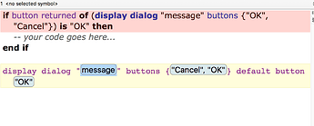
Call me nit-picking, but there’s an inconsistency in the button order of the built-in code snippets.
dd has cancel / ok, whereas idd has them backwards as ok / cancel
That results in a very weird looking dialog box to me, and one that could cause users to reflexively hit 'OK" when they meant cancel.
I know I could add my own and delete the built-in one I see from the Help viewer that I can in fact edit this, but it would still look better if they were provided out-of-the-box in a way that was consistent with each other, and in the conventional order.
