That’s the first part of my “manual” etc. review, and since the Lite version was just advertised I thought sending this first was the best timing, if not a bit late…
[Paid features]
I understand the idea behind the [Paid] icon but that’s one of the things I dislike the most in “lite” version designs. It’s way too much in your face “pay or you won’t get this feature” style.
If I may suggest, dimming a feature with a different color would convey the same message (pay to unlock) but in a less vulgar and UI friendly manner.
Same for the documentation. the [Paid] fluo green icon in the manual body is a sore in the eye. Highlight the paid features in a subtle way (slightly different color, etc.) or do something similar. But keep it subtle.
In Full mode, the [Paid] icon is removed from the UI but not from the manual.
Some background: We think what BBEdit does is really good, but obviously we can’t just copy it.
Initially we used a grey Paid icon, and then we moved to a padlock icon. We felt the padlock icon was a bit confrontational, and what you see now is what we came up with next.
Whatever we use, it has to involve adding an image, not a change of color.
So putting aside the documentation issue for a moment, we’d love to hear suggestions.
I’m not aware of what BBEdit does so I can’t tell, but if it’s what I suggested and you think it’s good, I’m not sure I see why you think should not copy it. In the opposite, that would set a non aggressive trend for Mac designers…
Another suggestion would be to use a colored dot, in a color other than red Maybe green. Also, design wise, I would not put the extra info before the menu string but right after. Like:
[Paid] Open Quickly…
Open Quickly… ●
People who chose to use the Lite version should not be visually punished for doing so, that’s the deal both LNS and them agreed upon.
I’ve known Rich for years and I’m not willing to copy his icon - it would be impolite. We need something that has the same level of obtrusiveness and is unique to SD. Any constructive idea that fits within the limitations of the menu manager is welcome.
As far as an indicator in the menu goes goes I prefer it the way it is now in SD7. One thing that drives me crazy is when I come across a nonstandard indication of something and I have to go looking for what it means. “Paid” is a lot more more descriptive then a color for this. While some people might not catch what it means, they would have a a good idea it has something to do with money, and therefore it would be fairly easy to find.
I value “clarity” in an interface over “less confrontation but more vague.” This is a free program indicating what the paid version does. It’s very clear and less frustrating. So I guess it is a balance between conciseness and intimidation.
It is assumed that users will first use SD for 20 days in Demo mode, during which they will have ample time understanding the meaning of whatever indication there is in the menu that points at “full version only feature”. 20 days (and information on the site and other places) is plenty of time to understand one UI feature.
As for “clarity vs confrontational”, I’m not sure that’s the point here: as I wrote above, people who chose to use Lite instead of Full have a deal with LNS. So being polite about their choice is pretty important in my opinion. Having a flashy PAID icon all over the place is plain rude.
I wasn’t saying you objections are not valid objections. I was just saying how I would look at it. You had a good point and I was just adding to it. Thanks for sharing your comments
Mark, there have been many posts since the above, so you may have moved on from here. But here are my thoughts on this:
If you like the BBEdit Icon, then ask for permission
I appreciate that you don’t want to just use it, but perhaps Rich would be willing to license it to you.
I don’t know if there is a standard for this (guessing not), but the more apps that use the same UI the more intuitive it becomes for the user
Since BBEdit is one of the most used Mac apps, those familiar with the BBEdit icon and meaning would know immediately what it means in SD7.
Just my 2¢.
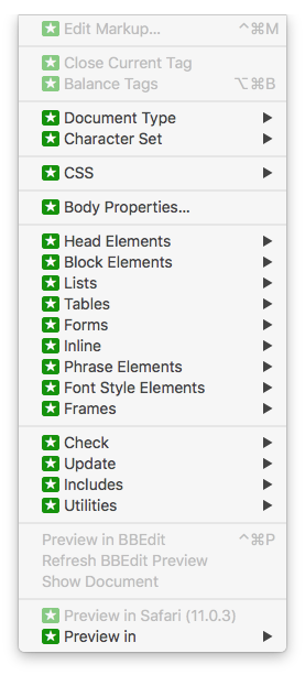
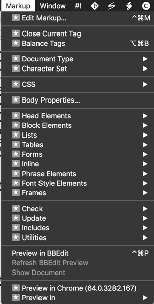
BTW, I had a licensed ver of BBEdit 11, but recently upgraded to Ver 12, and have not yet paid for the upgrade (but I plan to). IAC, here is how the “Paid” features look in the demo version on my iMac-27.
 Maybe green. Also, design wise, I would not put the extra info before the menu string but right after. Like: