Find and Replace UI

The UI for find and replace is still irksome.

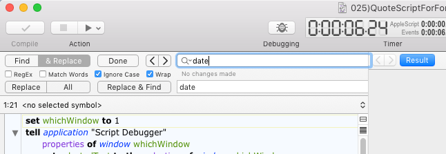
First, is it possible to nudge the search field and < > buttons to the left to fill the empty space? On a narrow editing window (laptop) you can’t see the √ boxes.

Second, can the tab order be changed? It seems like it’s worse now than in SD6. If I enter a find string, and hit Tab, I want the cursor to go to the replace string field. Instead it goes to every other element in the Find/Replace pane before it gets to Replace. You have to hit tab 8 times.

These have been irksome issues since early SD 6, I hope they can be addressed.

Also, would it be possible to get an indication of how many instances were replaced when doing a Replace All?

The solution to this is to turn off Full Keyboard Access in System Preferences. With that on, Script Debugger’s tabbing order is overridden.

What — and put it in that empty space to the left of the < and > buttons? :wink:

BBEdit uses notifications. That’s painless!

Or, you could use a splash screen like the one used when a find all wraps!

Much improved! Fewer tabs to get from Find to Replace, and they make sense. Interface looks better to, and the find-all count works!

Thanks!

One very tiny UI visual thing.

If one of the fields is selected, and you narrow the script editing pane, the right edge of selected highlighted field intrudes a little into the Inspector pane.

I’m glad you said “very tiny”, because you’re going to have to live with it for now. The possible solutions are either too drastic at this stage, or have even worse side-effects.

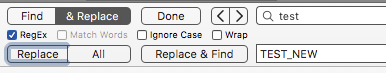
So how about this, when tabbing it jumps from the Find Field to the “Replace” button, to the “Replace & Find” button and then the replace field.

I thought this was fine (definitely an improvement) but when you tab to either of the two buttons, and they become active or highlighted, hitting enter or return doesn’t “click” the button.

It would be better to not tab to those buttons, than to tab, but not being able to do anything. Could they be untamable, the way the “All” button is?

I think you missed my answer earlier:

I take that back — I misunderstood what you were saying. I’ll see if we can do some taming.

1 Like

I would prefer that you do NOT do that – Please leave control of tab movement to us.

IAC, I have what I think is a very good work-around:

  1. ⌘F to show Find/Replace block
  2. Initial focus in in Find box
  3. SHIFT-TAB to move to Replace Box
  4. TAB to move to Find Box
  5. Repeat 3 & 4 as needed
  6. Multiple TABs if you want to set the check boxes.

So this gives us one keystroke to toggle between Find and Replace.
I think with a bit of use it will become muscle memory.

So my vote is to leave the Find/Replace UI as is.
Script Debugger 7 7.0 (7A36) on macOS 10.12.6

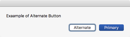
I see the same behavior. The button is highlighted like when an alternate button is show, but pressing SPACE does NOT click the button as it does with alternates:

image

image

That’s a limitation of segmented controls.

So what if it tabbing works like this:

  • With Full Keyboard Access on: Find string -> RegEx -> Match -> Ignore -> Wrap -> Replace string -> Find string

  • With Full Keyboard Access off: Find string -> Replace string -> Find string

The various replace buttons represent menu commands, so they can be assigned keyboard shortcuts.

I think this is what Ed was suggesting above, and it doesn’t break what Jim outlined.

That’s fine with me. That’s how it works now.

Yes, I think that’s well tamed. (FWIW, I tried turning off Full Keyboard Access and it made a mess of tabbing in forms in other apps and browsers so I appreciate this solution.