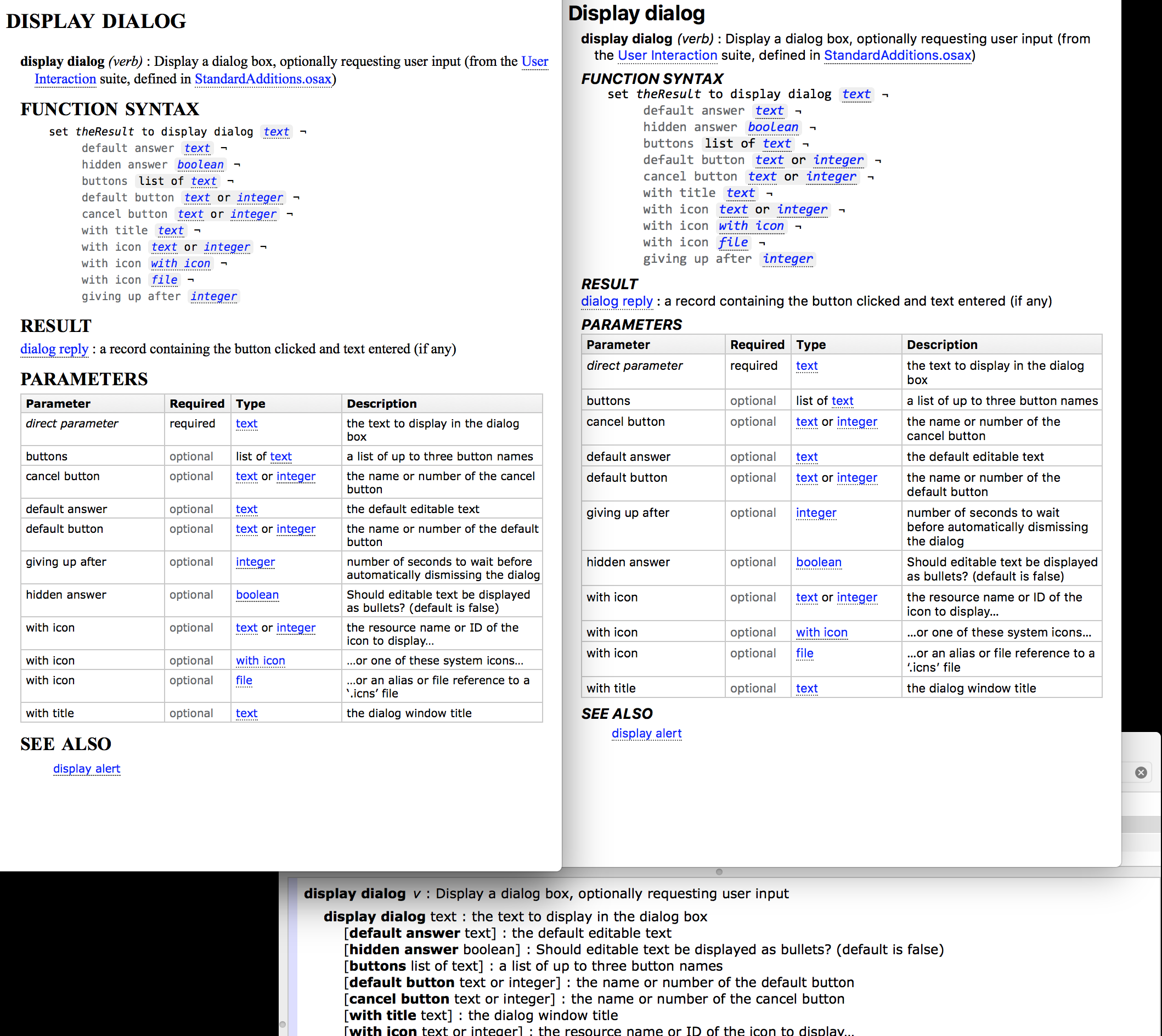
The new Dictionary display seems cleaner overall, but I have a few stylistic comments:
First, it capitalizes the first word in a dictionary item. This really looks weird as this is not how things look when they’re compiled.
Second, the (remaining) all-caps headers seem really vertically squashed. Perhaps there could be a tad more vertical space above each header to separate it more?
Here’s an example (SD6 vs SD7 vs Script Editor). I find the sections in the SD6 version a lot easier to distinguish.
We’d be interested to hear more opinions on this. There were two main reasons for this change: to show more on smaller screens, and to deal with the fact that the same content appears in the Dictionary pane of the Inspectors tab, which is particularly constrained for space.
I’d also be interested in opinions on the main heads: go back to all caps, or match the style in the dictionary (ie, no initial cap)?
That does not bother me. Either way is fine. No matter how I type it, it compiles correctly.
I don’t see an issue here, and usually I’m very sensitive to formatting issues.
@ShaneStanley, I have to say that I really like moving to a sans serif font — always MUCH easier to read on a monitor than a serif font.
FWIW, my favorite, most readable to me, is Verdana. I know that’s not an Apple font, but it does seem to come on all Macs. It is a bit wider than Arial or Helvetica or Helvetica Neue. You have to use Helvetica Neue 16pt to match Verdana 14pt.
I, like almost all men > 40, suffer from Presbyopia, which makes small serif fonts very hard to read.
I would prefer no initial cap, though the new display is still better than all caps in the old one.
Looking at RESULT, PARAMETERS, etc., usually seeing anything in all caps italic would bother me, but in this case it works well to help categorize the items.
I would normally find a serif font more readable, though I certainly have presbyopia as well. I’ve even switched some of my online newspaper displays to serif to help with reading. But this looks good.
How is Apple’s “San Francisco” font better than Helvetica Neue?
SAN FRANCISCO IS EASIER TO READ ON-SCREEN
Like I said, as you can learn from Garamond, pixels are not a friend of typographic subtlety, and even with increasing screen resolutions, type is being displayed on increasingly smaller screens.
Besides, whatever font Apple makes the default will be used by thousands of developers who will do all sorts of things with it – such as displaying it on noisy backgrounds – to make it even harder to read.
So, Apple can’t take any chances with legibility. Here are some of the ways San Francisco is easier to read on-screen.
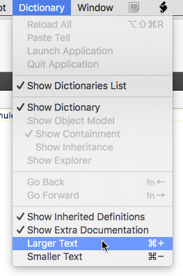
Yes. The textual dictionary description starts as XML (SDEF), is transformed to HTML with an XSLT stylesheet and is formatted using CSS. Anticipating the suggestion of offering “themes”, we’ve considered that but opted not to do that for Script Debugger 7.
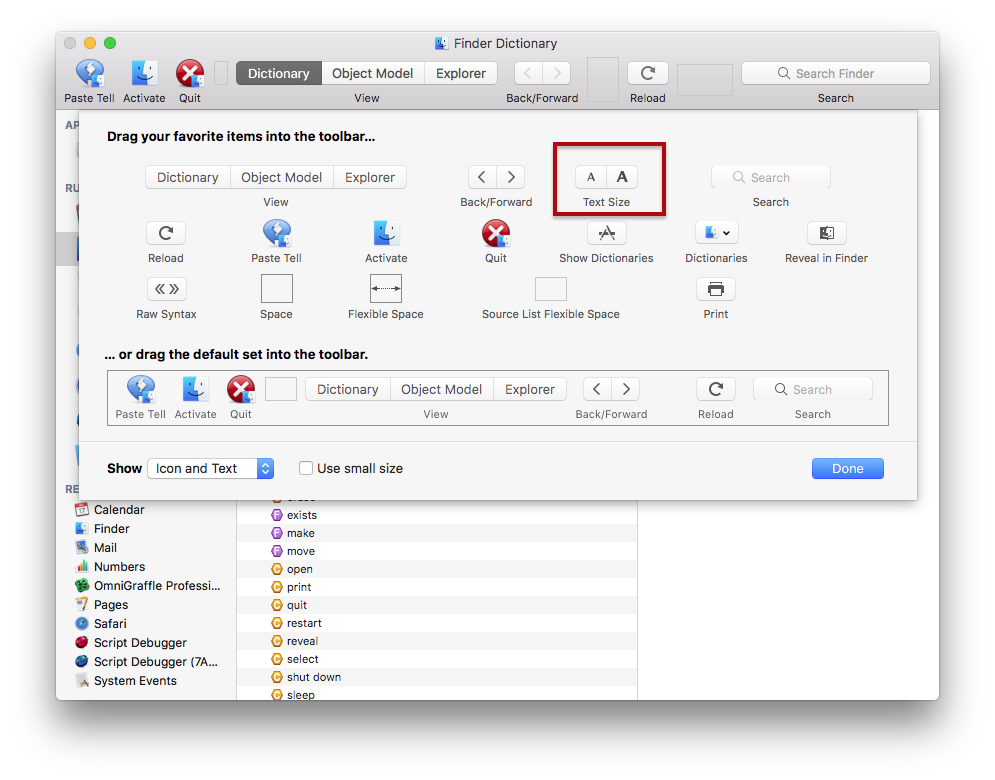
The outline Jim points to in his screenshot is a Cocoa outline and is not CSS driven.
This is not a user editable thing. But you can look at it in Script Debugger.app/Contents/Frameworks/RosieKit2.framework/Versions/A/Resources/AppleScript.dictSyntax/Contents/Resources.
 I could only find a css file for the help package, so I guess that data is not available in the distribution?